7 reasons your visitors (and Google) don’t like your mobile site.
A few years ago you probably started seeing your online competitors adapting to mobile design and said “crap, time to redo my site and keep up”. First off, kudos to you for coming to that realization! But (and this is a big but), you probably didn’t follow some best practices and are losing out on repeat visitors. In this post I’m going to cover 7 of the most common reasons you are losing sales because of poor mobile design.
1. Your website still isn’t responsive
You go to your site on your phone and there it is – your beautiful website you paid your friend to make for $500 in all it’s flashing glory. You have to pinch to zoom, and you can barely see what the website says, but at least it actually loads. I say “flashing glory” because if you haven’t made your website responsive yet then chances are you are still stuck in a Geocities mindset where flashing buttons means you can get their attention which means they will buy from you. First of all, if you have any flashing buttons on your site please go remove them immediately before you cause another seizure. Secondly, just because your site actually loads on a mobile device doesn’t mean it is mobile-friendly.
61% of people won’t go back to a site that wasn’t optimized for their phone. Also, as of May 2014 Google sees exactly what the user sees – they will know if it’s not responsive and have changed their algorithms to relfect user experience from mobile devices. So, if you care about conversions and rankings then you better get on the responsive train.
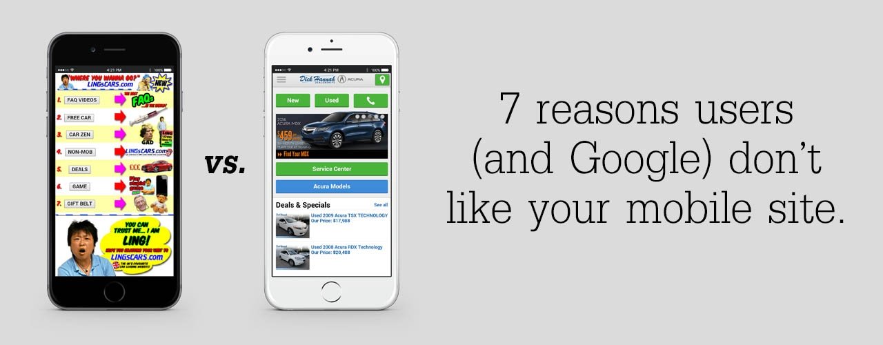
2. Your mobile site was created by a mobile website converter
My biggest point here is that typically, mobile website converters are going to show bare-bones info to your users. Before you get all up in arms that I’m knocking mobile website converters let me say that there are some situations where a mobile website converter like DudaMobile will work just fine. For example, if you are a taxi driver your site only needs to do 2 things: tell people your service area and have a click-to-call button. For everyone else, mobile website converters are going to short you for two main reasons:
- It creates an “m.” before your url (instead of www.). Google is going to ding you for this.
- It cuts out a ton of information that you probably want to have on your site.
Last night my fiance and I were searching for wedding venues online and I was furious at the lack of attention on their mobile sites. If they even had one, they used a converter which removed nearly all images and had limited text. How in the heck can I pick a wedding venue if you take away all the pictures while I’m on my phone?
3. Everything found on desktop is showing on mobile
You can have too little info on your mobile site and can definitely also have too much info on your site. This conflicts a tad with my last point but you need to find the happy medium which gives them everything they want in a simple manner. A page on a desktop that scrolls three times will scroll about 30 on a phone. Go through and hide the extra images or text that isn’t imperative to converting them.
4. Treating mobile visitors like desktop visitors
You can have the same user visit your site on the phone and desktop but while doing so, they are in two different mindsets. If they have taken the time to view your site on their computer then they have set aside more time to peruse. If they are on their phone you’ve got to plan your site to their environment – they are on the go, they are on a break at work, they are dodging soccer balls while sitting at their kid’s game, they are laying in bed half asleep, etc. On your desktop site you may have a whole page leading down to the conversion but on a phone they won’t have that kind of time or patience. Get that call-to-action front and center!
Even the verbiage you use for your call-to-action matters. If you are in the service industry your call-to-action for desktop could be “fill this form out to get a quote” while on phones your call-to-action is “call now for immediate help.”
5. Not optimized for speed
Size matters. Seriously. Your site with big beautiful images could look awesome on a desktop computer with 3 mb/s download speed but those 1 mb images won’t fly on a phone. If possible, use “srcset” in your code to define different images for different screen sizes. Check out responsiveimages.org for more info on how to do that. At the very least, use compression software to get those images smaller. I lovetinypng.com for shrinking .png’s quickly. You can drop file sizes down by about 70% most of the time.
Pay attention to your desktop site when you are trying to make your mobile site faster. We love usinggtmetrix.com to diagnose speed problems. The added bonus of optimizing your site on desktop should be that your mobile site speeds up too.
6. Hard to convert
Smaller real estate means you need to simplify, cut out nonessentials and bring the important stuff front and center. Here are a few tips:
- Make sure your call-to-action is showing at the top and your forms are efficient and streamlined.
- Use real-time validation on your forms so that people don’t have to fill it all out again if there is an error.
- Provide visual calendars (datepickers) rather than having them type in dates.
7. Poor navigation
One of the most common complaints I’ve read in study after study is that there was no simple way to get back home on a mobile site. On a desktop site you usually can click on the logo to go back home but for some reason, mobile site creators are leaving this simple function out. Another thing that can help is to hide certain items in your menus that you don’t need on mobile. If someone is on the mobile-version of your rubber band ecommerce site they probably don’t need to see that menu option for how the rubber band was invented.
Not just about making it smaller
Mobile website design is not just about shrinking design to fit appropriately on a phone. It’s about delighting your customers with an entire mobile experience that keeps them coming back time and time again. This is what will further increase your ROI from any kind of online marketing which involves your website. We tend to get too infatuated with making sure our site resizes text and images correctly for mobile and forget that there is plenty more to it. Make some of these changes and then watch your bounce rates and conversion rates. I’m sure you’ll be happy with what you see!