Did you know that within your existing Google Analytics account, you can see a report that gives you a visual assessment of your statistics for each page of your website?
Yep, that’s right! Through In-Page Analytics, you can see performance stats on each of your website’s pages, including bounce rate, time on site, and average load time. You can even use color coding to see which links and buttons prompt the best response percentage.
Ready to use it? Here are a few helpful how-tos to get you started.
1. Accessing In-Page Analytics
To view the In-page Analytics report, go into your Google Analytics account dashboard and click on Behavior. In the Behavior drop-down menu, you’ll see In-Page Analytics at the bottom. It might take a few minutes to load, and may even show you an alert indicating there was a problem loading the page. If this happens, you should be able to click Load In Full View to open In-Page Analytics in a new page.
2. Making sense of the metrics
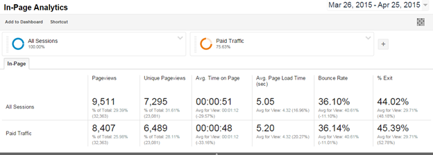
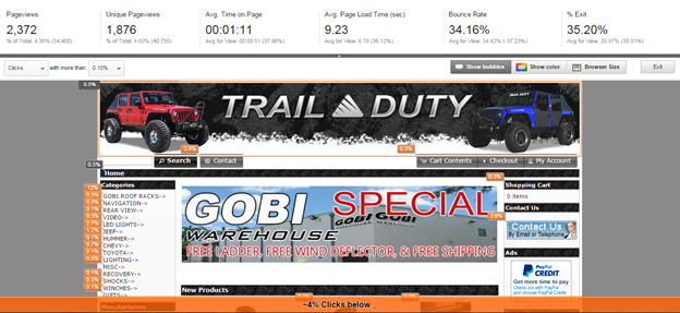
At the top of the page, you’ll see a menu bar that looks similar to Google Analytics performance metrics. However, you might not be familiar with these stats. Here’s a quick run-down:
- Pageviews – the total number of pages viewed. Repeated views are also counted.
- Unique pageviews – the number of visits where this page was viewed at least once.
- Average time on page – average amount of time spent on this page.
- Average load time – average amount of time in seconds for the page to load.
- Bounce rate – percentage of users who left your site without interacting at all.
- Percentage exit – number of users who exit the site/number of pageviews.
3. Looking at data
- First, you’ll probably notice the orange bubbles. These denote the percent of your traffic that clicked on this feature, which is useful for determining which feature users are most attracted to.
- The orange bar at the bottom shows the percentages of clicks that user clicks that are below the fold. This is another way of determining whether or not users are getting where you want them to go. Most clicks generally happen above the fold.
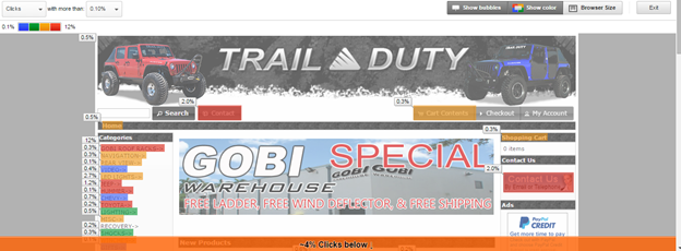
- Clicking the Show Color button highlights the feature that is getting the most clicks by color-coding the different percentage ranges.
4. What you should be asking yourself
- Is my website layout optimal for what I want users to accomplish on the page?
- Are my users seeing the content I want them to see?
- Are my users finding what they’re looking for on the page?
- Are my calls to action motivating and visible enough?
- Which links are users clicking (and which are users not clicking at all)?
5. Where you can find more information
More questions? Just ask an expert!

Logical Position, an Inc. 500 digital agency supporting 5,000+ clients across North America. LP is the proud recipient of Google’s Lead Generation Premier Partner of the Year and Microsoft's Global Channel Partner of the Year 2024! The award-winning agency offers full-service PPC management, SEO, Paid Social, Amazon and Creative Services for businesses large and small. As a Google Premier Partner, Microsoft Elite Partner & Meta Business Partner, LP is in the top 1% of ad spend managed across platforms.
