A website that’s easy on the eyes isn’t always easy to use. An attractive website is great, but it’s only one piece of the puzzle. If your website is beautiful but the user experience is poor, you haven’t addressed the root of the problem.
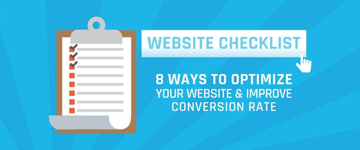
Thankfully, we have a few solutions. Below is a website checklist that will help you improve conversion rates and jump-start your online performance.

1. Responsive Design
The average person spends 5 hours per day using a mobile device. That’s more than the majority of people spend binge-watching Netflix (1hr. 33min.), playing video games (1hr. 7min.), and watching television!
How many times have you turned to your phone for directions or a recipe? In those times of need, you expect to see a webpage that is easy to navigate and designed with your phone’s layout in mind. A device-responsive website will adjust its size according to the device it’s being viewed from, making it easy to give your entire audience a great experience. Google will eventually roll out its mobile-first indexing; another move by the company towards a mobile-centric world. Two things continue to matter the most to the search engine: speed and agility.
Having the best Organic rankings or the most optimized AdWords account can only bring visitors to you; your website is what makes them stay. If the atmosphere doesn’t account for their device — mobile, tablet, or otherwise — then it’s not doing its job.
Most content management systems (WordPress, Squarespace, Shopify, etc.) have adaptive templates that are user friendly — for you to edit and for your target audience to happily navigate.
2. Create A Call-to-Action
An important element of any website, your call-to-action (CTA), doesn’t just tell the customer what to do, it makes them do it. Your CTA is more than just the “Buy Now!” button on your site. A well-crafted CTA is located in a purposeful, easy-to-find place, and stands out from the website. It’s thoughtful and reflective of your goal. It’s simple.
Take a look at your current CTAs and see where they rank against this list:
- Clear: Is your CTA easy to read? Is it easy to find? Is it above the fold?

- Pizzazz: Is your CTA attention-grabbing? Is it brightly-colored? Is it different?

- Directive: Does your CTA drive action? Does it tell the user what to do?

- Concise: Is your CTA brief? (that’s all we want to know.)

Follow the above and your users won’t be able to keep their cursors off your CTAs!
3. Be Easy to Reach
Don’t be complicated, be easy. If there are too many steps in between someone visiting your page and purchasing your product, they will leave. This is the internet after all; the world of instant gratification.
Make phone numbers, forms, and check-out carts readily available and functional. Give your users what they want — auto-fill forms, contextual keyboards for mobile, and lots of breadcrumbs. Google Analytics is your friend and will tell you where traffic flows and where it’s in a five-car pile up.
4. Fast Load Time
Goldfish have longer attention spans than most millennials (not that there’s anything wrong with that), which means you need to get their, and everyone else’s, attention. Fast.

Recent case studies have shown that faster websites lead to higher conversion rates (duh) and better customer loyalty. Forty-seven-percent of consumers expect an e-commerce page to load in 2 seconds or less!
You can see how your site performs with Google’s PageSpeed Insights via TestMySite. Frequent problems we find are:
- Optimizing images
- Enabling compression
- Leveraging browser caching
- Minifying resources such as HTML, JavaScript, and CSS
Adobe Photoshop is a great way to optimize images for the web. If you’re not 100% sure what “minifying” your resources means, feel free to give a shout to our SEO Team for a site review and advice.
5. Clean Structure & Flow
Your website is not for you; it is for your users and should be built with the user in mind. The move from page-to-page on a site should be effortless from Point A to Point B. Website flow—per fundamental design principles—is the marriage of form and function.
If you put your grandmother on your website, would she be able to navigate from the homepage through to a purchase? If the answer is no, than chances are there are design elements you can implement to better the flow.
6. 404 Error Pages
A 404 Error is presented to the user when a page cannot be found or won’t resolve. There’s nothing inherently wrong with a 404 per se, because technically all websites contain an infinite number of them. However, it’s a problem when backlinks and internal links are missing or don’t lead anywhere. The problem becomes worse when those pages are being indexed in search engines.
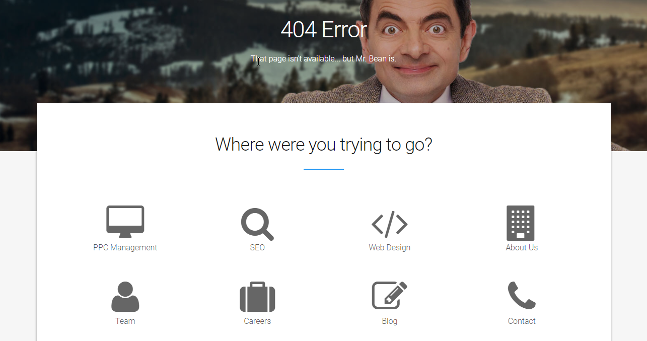
Have a little fun with your audience and create a custom 404 Error page that won’t immediately scare away potential customers. Give them a good laugh then guide them elsewhere.
Checking for 404 errors doesn’t have to be time consuming or costly. Screaming Frog is a killer tool for checking broken links. It also evokes some interesting brand-origination questions.
7. Show Off A Little
If someone expects a peanut butter sandwich, and they bite into a mayonnaise sandwich, they are going to look at their next sandwich with greater scrutiny. Similarly (yes, it is similar), if someone expects to see something after they click a link or product, you better fulfill their expectation.
Accreditations and certifications help consumers gain trust through third party accolades, as does a thorough “About Me” section.

But real trust comes from following through on a consumer’s expectation. Make sure your internal search turns up valid results, your hyperlinks connect, and all of your CTAs clearly outline what happens next.
Making yourself accessible to both potential and existing customers encourages open communication and gives searchers that warm fuzzy feeling of knowing they can get the answers they need at the click of a button.
The last piece of this circle of trust is a well-designed website, visually and structurally. It takes someone roughly 50 milliseconds to form an opinion of your website. As much as we want to believe looks don’t matter they can often make or break the credibility of your site.
Don’t scare away potential customers with an overcrowded site. Keep your design and structure simple with the intent of pushing users in the intended direction. Further improve conversion rate, by adhering to SEO best practices to keep Google a happy user as well.
8. <H1> HEADLINE HERE </H1>
A powerful headline is the hook that latches on to your audience and reels them to your site. A strong headline speaks directly to your customer, answering their questions and capturing their motivations. The ultimate influence of a headline is to showcase the value you provide to your customers. If you can predict what searchers are looking for, your headlines will tickle their curiosity with answers to questions they haven’t even thought of — they simply won’t resist!
This website checklist is by no means a measuring stick of success, but all journeys begin with that first step. Now that you know where the starting line is, put your best foot forward and start sprinting towards that finish line. Whether you’re new to Online Marketing or a seasoned veteran, this website checklist will prove to be an invaluable tool that is sure to improve your conversion rates.