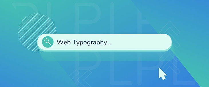
Typography is a crucial element in website development. Many people may not consider font or type visuals when designing their websites, but every detail matters for visitor retention. This is especially important for any onsite copy and blogs. Check out this brief guide to web typography and designing for readability to learn more!
Why Typography Matters
Typography plays a significant role in the success of your webpage’s readability. It conveys a clear message to the visitor, which builds engagement within the website. Website interaction ensures greater visitor retention and interaction. Contrarily, poor typography can lead to poor web engagement. Many business owners make the mistake of using decorative or creative typefaces, which can increase load times, and in turn, bounce rate on their websites. Decorative typefaces do not always lead to a better website.
Typography Guidelines
With that in mind, there are a few guidelines to consider when implementing proper typography on your webpage. First, don’t make more than one change to a typeface on a webpage. Keep in mind that one variable change—whether in the form of color, font, or size—alters the performance of a webpage. Readers want a clean look with a smooth font. For example, headers with sans serif font perform well, as does smaller copy with a serif font. Specialized fonts negatively affect your website’s performance because they impact load time. More importantly, not every browser or operating system can render specialized fonts that are less likely to be consistent among end-users.
Graphics and Other Extras
Graphics and other visuals are additional factors to consider when designing for readability and following a guide to web typography. One tip to remember is to match graphics and visuals to the rest of the website. Images should render in the background to create a smooth reading flow. Visual aids help accentuate the point of your product or service page. You should continue to avoid decorative or creative fonts in your imagery. Visual aids must still remain clear to readers in order to complement the blog or other onsite content.
Typeface Styles for Digital Marketing
There are a few key elements that are common among the typeface styles that are best suited for digital marketing. Google offers a wide selection of fonts on their Google Fonts Library that is geared toward website performance. These fonts run smoother than anything a client may request. Logical Position also offers a branding and style guide tailored to your website to ensure optimal readability and legibility. This guide is client-focused to enhance the visuals and performance of your webpages’ retention rates.
Logical Position is the ultimate solution for small business website development. We build websites for success. With our team of professionals at the ready, we’re prepared to build you a modern, user-friendly website optimized for search engines and device displays. Logical Position offers many business packages for a quality, effective turn-around in your online performance. Contact us for more information on how to start today!