What’s in a Logo?
The idea of a “brand logo” goes back to the old west, when cowboys would imprint their cattle with branding irons to mark them as their own. Though it’s a little painful to imagine, this image speaks to the fundamental purpose of your company’s logo: to mark your customers’ minds with an image that defines you.
When done well, a logo reflects and communicates everything that a customer needs to know about a brand. Without a compelling logo, a brand will struggle to not only be recognized, but also–and more importantly–to be trusted. Think about it. If a company’s logo doesn’t resonate with a customer’s sense of what’s appealing and desirable, then that company has failed to communicate its ability to reliably fulfill that customer’s needs.
Now that’s a problem.
This guide will help you avoid that problem by explaining four key principles of how to design a lasting logo. Whether you’re just beginning to think about branding for your new business, or whether you’re considering a refresh for a logo you’ve been using for years, the guide will help you think about what makes a logo fitting, legible, versatile, and, ultimately, memorable. While the process of actually designing logos is quite another task–and one naturally best done by seasoned experts–engaging in this thinking is an important first step. From color and typography, to shapes, imagery, and other styling choices, you’ll come to see that it really is all in the logo.
Step 1. Make it Fit
A fitting logo is one that reflects your company, industry, and customers. Ideally, your logo gives your customers a feel for your company’s personality and the sense that you’re in touch with them. To avoid confusion, your logo should also send the right signals about what work your company actually does.
Your Company
Apple’s brand name and logo were inspired by the apple that dropped on Isaac Newton’s head and led him to discover the laws of gravity.
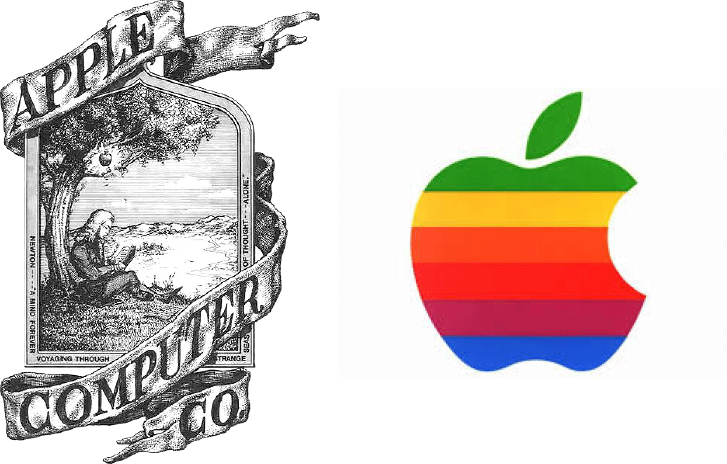
Apple’s Original Logo (circa 1976) Redesigned Logo (1976-1998)
The company quickly abandoned its first logo in favor of a simpler, more memorable design, but they knew from the start that they wanted a logo that stood for innovation.
Take Google as another example. In order to communicate that they’re playful, curious, and good-intentioned, Google aimed for a childlike design made up of primary colors–red, blue, and yellow.
 Even with these two examples alone, you can begin to see all the possibilities you have for designing a logo that expresses your company’s personality. Whether it’s innovation, playfulness, reliability, health, sophistication, or something else entirely, your logo can represent it.
Your Customers
In addition to expressing who you are as a company, your logo can speak directly to what your customers want. If you know that customers in your industry are looking for certain qualities or benefits in a product or service, then it may be appropriate to design your logo with those things in mind. Take Pizza Hut for example.

Rather than communicate a big idea like innovation, Pizza Hut designed a logo that conveys the more concrete service that its customers are looking for: fast, casual dining. The “fast,” slanted lettering, loosely drawn shapes, and other design features–like the circle-shape’s nod to the actual products they offer–all convey that Pizza Hut offers that service.
Similarly, tool manufacturers like Stanley and DeWalt understand that their customers want sturdy tools that they won’t have to worry about breaking. As a result, these companies designed logos that use strong color combinations, capital letters, and no “decorative” images to represent their products.

As you’re designing your own company’s logo, follow these companies’ example by taking some time to think about what specific features and benefits your customers are looking for.
Your Industry
Lastly, make sure your logo is a fitting representation of your industry. Now this isn’t to say that plumbers should include plungers in their logos or that landscaping companies should include plants in theirs. But it does mean that you should consider whether your logo will in any way confuse customers about what it is that you actually do. There is true theory behind colors, shapes, and typography choices that can influence your customers’ initial thought one way or another. Make it count!
Step 2. Make it Legible
If your customers can’t read your logo, they can’t be persuaded by it.
As much as you might like to design a complicated logo full of neon colors and curly fonts—don’t. Even though it might seem counterintuitive, your logo will be much more effective if its content, color, and typography are simple and easy on the eyes.
Images
Remember Apple’s first logo? The one of Isaac Newton sitting under the tree? How long did it take you to “read” that scene and understand it? From a brand marketing perspective, the answer is “too long.” You have 3 seconds to capture your audience’s attention–much longer than that, and they’re off in search of your competitors. When you’re first designing your logo, you might fall into the same trap as Apple did by attempting to include a very detailed image or lots of words. Avoiding this temptation can mean the difference between creating a logo that overwhelms your customer, and one that speaks clearly to them.
Like Apple, Starbucks also stripped their original logo down to make its central image more legible:
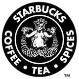
Starbucks’ Original Logo (1971)
Starbucks’ Redesigned Logo (2011)
Although Starbucks’ original logo has a certain charm, it’s hard to read because there’s so much content squeezed into it–the company’s name, its products, and that small, extremely detailed picture of a mermaid. In redesigning their logo, Starbucks effectively did a “zoom in” on the original, cutting out all the text and most of the mermaid’s body to bring her face into sharper relief. (Fun fact: in order to make the mermaid more human, the company also made her asymmetrical. If you look closely, you’ll see where.
The result of Strabucks’ logo redesign is a much clearer, more legible logo that customers can quickly absorb and remember. Now some could argue that eliminating their service offerings from the logo could have been a disservice to them, but when Starbucks made the change, it was already so popular that people knew its products.
Colors
The color of your logo can say a lot about your company. Different colors evoke different moods, and companies will take advantage of this fact to associate their brands with certain emotions. Black, for instance, tends to be associated with luxury, style, and authority. For example, Chanel, Prada, Dolce & Gabbana, and Gucci all designed their logos in black. On the other hand, many tech manufacturers and service providers like IBM, Siemens, and AT&T designed their logos in blue because of the color’s associations with dependability, security, and trustworthiness.

In deciding what colors to design your logo with, think not only about what mood you’re trying to evoke, but also about legibility. Notice how IBM, Chanel, and Starbucks all use only one color in their logo? Well, one of the reasons they made that choice is that it’s much easier for their customers to visually process one color than it is for them to process four or five colors. For maximum legibility, stick to just a primary color and a secondary one. Adding a third color can be effective, but just be careful not to go too crazy with the color palette.
Beyond the mood and number of colors you use, consider more nuanced color effects like contrast and glow. In general, it’s a good idea to use colors that clearly contrast with each other. If the colors are too similar, then they can blur together in ways that will make it difficult for your customers to see. These types of effects don’t always appear well at all sizes or in print, either. The same is true for shadow and glow effects as well. So so use them sparingly, if at all.
Typography
This one’s simple. Make sure that your customers can actually read your company’s name! Notice how easy it is to read Adidas and Amazon’s names?
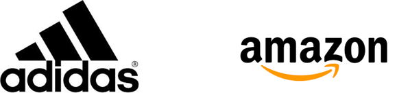
That’s what you’re aiming for. Easy reading. To hit that target, be careful about using looping, curly, script, or otherwise complicated fonts. The typography in Adidas and Amazon’s logos are strong examples of not only font style, but also of why it’s a good idea to limit text warping, stretching, and similar effects. Because their brand names aren’t distorted in any of these ways, these companies’ logos read effortlessly.
Step 3. Make it Versatile
When it comes to logo design, versatility means that your logo can be transferred into various color schemes and sizes without any loss in quality. A versatile logo design is one that will look good whether it’s displayed on a billboard or a business card, or whether it’s printed in full-color or black-and-white. A versatile logo is also one that will stand up over time rather than appear outdated in just a year or two.
Color Schemes
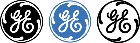
To avoid any unfortunate representations of your logo when printed or displayed in grayscale, be sure that you’ve seen what your logo looks like in black-and-white before committing to it. To cover all your bases, it’s also a good idea to test whether the black-and-white version of your logo looks good inverted–that is, with its black and white colors flipped around. Sometimes the inverted black-and-white version will be the best choice for print materials.
Sizes
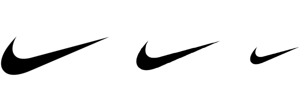
Ideally, your logo will look as good in large formats like posters, billboards, and desktop websites as it does in small formats like mobile screens, letterheads, product packaging, and small promotional items. Since shrinking your logo will make it difficult to see its details, the smaller sizes are usually harder to get right. For that reason, it’s good to test out your logo at those sizes early in the design process.
Thinking through how your logo will look in various mediums and sizes might not be as exciting as choosing what images or colors you want to include in it. But doing that work may very well save you the unpleasant experience of realizing that your logo looks awful now that’s printed in black-and-white on all your business cards!
Step 4. Make it Simple
By now, you can already see some of the reasons why simplicity is important in logo design. A simple logo is more likely to be legible than an overly-complicated one, especially at smaller sizes. The most important reason to aim for simplicity, though, coincides with the ultimate purpose of your logo: to make a lasting impression on your customers.
Memorability
So what makes for a truly memorable logo? In truth, that’s a hard question to give just one answer to. (If it were easy, then there wouldn’t be so many poorly designed logos out there!) But if you follow all of the advice in this guide, then you’re moving in the right direction. And when you find yourself getting bogged down in all the decisions about font styles, color, images, and everything else, just remember to keep it simple.

If your logo is simple, then it has the capacity to leave a clear and distinct impression on your customers. It’s the clarity and distinctness of that impression–along with all the feelings that go with it–that will make your logo memorable. The more complicated your logo becomes during the design process, the more likely it is to make a muddled impression that your customers won’t be able to absorb and remember.
So to make it memorable, make it simple.
Designing a logo is difficult work. Even for experts. If you’re in the very early stages of designing your first logo, need another set of eyes on an in-progress design, or want advice on how to refresh a logo you’ve used for years, the design team at Logical Position is ready to help.