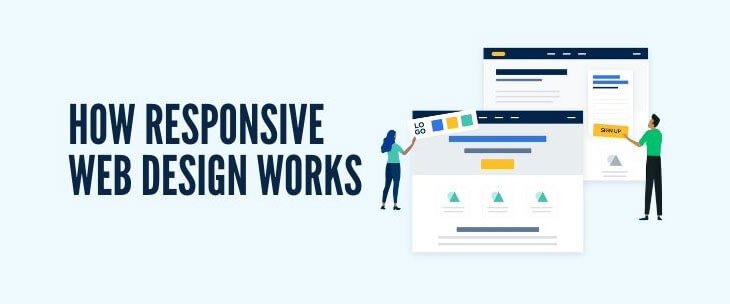
“Mobile first” is the saying in the digital industry that’s been guiding online companies to tailor their websites to fit the smaller screens of smartphones. The emphasis on mobile browsing began years ago, but the methods rapidly adapt to new consumer usability standards and user-friendliness. In the past, businesses typically created entirely different websites with unique URLs for their mobile websites. This method made it difficult for them to track conversions, as it resulted in two websites that required upkeep, maintenance, and tracking. Today, the standards come down to responsive or adaptive web design. Explore how responsive web design works.
How the CSS Works with Responsive Web Design
Responsive web design is fluid, while adaptive is more pixel-based. The CSS, or cascading style sheet, is where web developers implement responsive web design. Setting up a website with responsive web design means the website will automatically adjust everything on the web page using a percentage-based outline. For example, if you want a specific column on a page to take up 50 percent of the screen, then the column will take up 50 percent of the space regardless of the screen size. This keeps the design consistent and user focused.
With responsive web design, the exact same content doesn’t always appear on small screens and large screens—mobile devices often can’t handle all the extra fluff or content that looks clean on a laptop or desktop computer. Use the CSS to choose what to show and what to omit on your mobile site.
Effects for the User
As we mentioned, “mobile first” is often the go-to phrase for all things online, but the real priority is the user. Search engines rank user-friendly sites higher. Consumers prefer buying from businesses with sites that are easy to use, so the focus of a website should always primarily be the experience of the user.
Responsive web design takes away some of the headaches of mobile browsing for users. Even small inconveniences such as manually adjusting a screen to fit a mobile device can frustrate and deter users. It caters to the website user and provides a more pleasing experience.
SEO Implications
Google is making changes to make the Core Web Vitals more impactful on website rankings than ever before. This will now emphasize user-friendliness in loading, interactivity, and visual stability. Google is now recommending switching to a responsive web design model to keep up with changing expectations.
Responsive web design makes the user experience more enjoyable and seamless. It removes the cumbersome pinching and readjusting of the screen for users. This may seem like a minor inconvenience, but the standard of what users expect is rapidly changing. Users want the most seamless and user-oriented experience possible, and responsive web design achieves this.
For more information from our experts on how responsive web design works or for a free consultation on a custom small business website, contact Logical Position. We are a multifaceted digital marketing agency with dedicated website developers ready to work on a user-friendly site for your company.


