The navigation of a website is one of its most vital elements of quality web design. On a website, a few key things matter to consumers. Each ties into user-friendliness. Users of a website expect a site to load quickly and be easy to maneuver. When they come to a website, people expect to find what they’re looking for swiftly and painlessly. The navigation of a website determines how easy this task is. All too often, companies neglect their sites’ navigation—or overdo it. Explore how to improve your website navigation here.
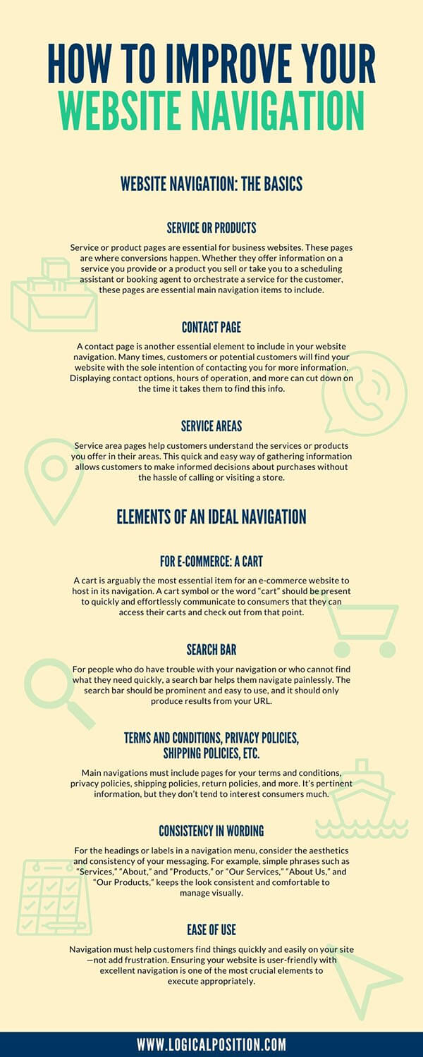
Website Navigation: The Basics
Website navigation is the way a customer interacts with the site and converts. With the goal of converting customers, the website should be easy to navigate, and customers should be able to quickly find what they’re looking for and easily make purchases or inquiries. The primary navigation on a website is its menu, which provides the options and links to get to all the other pertinent pages on the site.
Service or Products
Service or product pages are essential for business websites. These pages are where conversions happen. Whether they offer information on a service you provide or a product you sell or take you to a scheduling assistant or booking agent to orchestrate a service for the customer, these pages are essential main navigation items to include. Product pages should be easy to find and simple to maneuver.
Contact Page
A contact page is another essential element to include in your website navigation. Many times, customers or potential customers will find your website with the sole intention of contacting you for more information. Displaying contact options, hours of operation, and more can cut down on the time it takes them to find this info. On a contact page, include a phone number, e-mail address, and/or a storefront address with your open hours. This is all essential information for customers attempting to convert.
Service Areas
Service areas are other essential items to include in the main menu of a website’s navigation. Service area pages help customers understand the services or products you offer in their areas. This quick and easy way of gathering information allows customers to make informed decisions about purchases without the hassle of calling or visiting a store. It also provides search engines with vital information on where your business operates and guides people in specific service areas to your website.
Elements of an Ideal Navigation
Ideally, website navigations should load quickly, contain only necessary information, and get users from the home page to their goal in three clicks—preferably fewer. Navigation should follow the same fundamental setup as a website, which functions in hierarchies. Every single page doesn’t need to be present in the navigation. Elaborate menus take time to load and can be confusing. As long as navigation has a structured and logical hierarchy, most users will figure it out swiftly.
For E-commerce: A Cart
A cart is arguably the most essential item for an e-commerce website to host in its navigation. A cart symbol or the word “cart” should be present to quickly and effortlessly communicate to consumers that they can access their carts and check out from that point. When they’re finished shopping and ready to check out, customers don’t want to sift through 60 pages of informational pages to find their carts. Providing a quick and easy link to return to the cart is critical.
Search Bar
For all websites, a search bar is incredibly useful to consumers. For people who do have trouble with your navigation or who cannot find what they need quickly, a search bar helps them navigate painlessly. The search bar should be prominent and easy to use, and it should only produce results from your URL.
Terms and Conditions, Privacy Policies, Shipping Policies, Etc.
Main navigations must include pages for your terms and conditions, privacy policies, shipping policies, return policies, and more. Many businesses choose to place these in the footer links. It’s pertinent information, but they don’t tend to interest consumers much.
Consistency in Wording
For the headings or labels in a navigation menu, consider the aesthetics and consistency of your messaging. For example, choose one- or two-word labels and stick with them throughout your site. For example, simple phrases such as “Services,” “About,” and “Products,” or “Our Services,” “About Us,” and “Our Products,”keeps the look consistent and comfortable to manage visually.
Ease of Use
The ease of use should be the focal point in your website’s development and design. Navigation must help customers find things quickly and easily on your site—not add frustration. If a customer has to click more than three times to get to the page they’re looking for, chances are, they will give up and leave your site. Ensuring your website is user-friendly with excellent navigation is one of the most crucial elements to execute appropriately.

How To Know If Your Navigation Needs Work
In general, online consumers readily accept the responsibility of figuring out how a website works. This puts website owners at an advantage, as they already have the determination of the customer. When a customer is on a website, they will likely consider themselves at fault for any issues with finding things. So, if a customer or potential customer mentions that the navigation is difficult to use or that your website is hard to navigate, take them seriously. Navigation is a critical part of the conversion process, and you should give it proper investment and thought.
Customers Mention Lack of User-Friendliness on Your Site
If a customer takes the time to mention how difficult the navigation is to maneuver, it’s a serious indication that your navigation needs some serious work. On sites with effective navigation, customers mostly won’t notice how it navigates, since it’s working well. When a customer or client is so bothered by the difficulty of searching your site that they mention it to you or in a review, it’s time to act fast. Every moment you wait, you lose sales and conversions to a complicated web design.
Your Website Launched Without Outside Opinions
If a company launches a website without consulting outside, unbiased sources for honest reviews, chances are, there are some serious navigation issues. As a website or business owner, you may be too close to the site to notice its flaws. Consulting with a professional website development company or even unbiased friends or clients about how your website works is essential to having a user-friendly site. Often, what a business thinks a consumer wants isn’t what they actually want, so working from constructive criticism is essential.
You Have a “Mega-Menu”
They’re aesthetically very nice, but mega-menus are load time-killers that don’t help people navigate a site any easier than a regular menu can. Mega-menus often contain too much information, creating confusion and frustration for people looking for specific pages. They also drag down the overall performance of a site and won’t translate well to mobile devices. Mega-menus also preload, so they can cause lags and use way more bandwidth than necessary to run the site. Consider reducing any mega-menus into direct, straightforward menus.
Ways To Improve Ineffective Navigation
Often, the issue is with the site itself rather than with product or service options. Improving the navigation of your site can do wonders in terms of increasing conversion rates and reducing bounce rates. The best thing to do for any website’s navigation is to keep it simple and think about the website from the consumer’s point of view.
Keep It Simple
Eliminate any items that aren’t essential from the navigation. A good rule of thumb is to use the six most pertinent items on your site as your main navigation labels. If the navigation has more than 10 items, it’s a problem that you need to resolve immediately.
Find New Ways To Highlight Specific Site Areas
You don’t need to include every featured product in the main navigation. There are so many ways to promote specific products without crowding your site’s navigation. Consider using sections and links on your home page to point customers in particular directions. Few customers will look for specials, products, or services in the navigation menu.
Gather Thoughts and Suggestions
Ask people you trust to give you honest opinions on your website. Ask them to find specific pages and to let you know if they were hard to find. Consider their criticisms and suggestions, and apply solutions to your website. This can only make your site more user-friendly.
Think User First, Mobile Second
The saying in digital fields is “mobile first,” but this doesn’t accurately identify your first priority. The first priority of a website is the user. Focus first on the user-friendliness of the website, and then think about the mobile translations. Every site needs to be both user-friendly and mobile-friendly, but the user matters most.
Accept Bias
Every business owner is attached to and invested in their business—and they should be; it’s their business, after all! However, business owners should give themselves a bit of space from their websites by allowing others’ opinions to guide it into what it needs to be. Accepting bias and being willing to take constructive criticism is the best thing a business owner can do for their site. Business owners have a lot of in-depth information about their companies that general consumers don’t have, making the basics of a site challenging to create with these two different viewpoints.
Professional Website Development and Navigation Recommendations
When you’re developing a new website, updating an existing one, or even redoing an old one, consulting a professional website development company can make the difference between an effective and ineffective website. Online competition is rapidly growing, so setting your site apart from the rest is essential to keeping a flow of online customers. A professional website development company should be honest and work with the business owner or website owner to create a functional, user-friendly website that creates conversions.
At Logical Position, we provide honest, professional opinions and identify and resolve any issues or potential issues with our clients’ websites. Our company sets itself apart by offering comprehensive digital marketing options. With these options, you can easily integrate your website development with all of your other marketing. Our small business website development is an end-to-end solution for our clients. We know what baseline items your website needs to function, and we can accommodate PPC and SEO services without dominating a site’s marketing. When you’re thinking about how to improve your website navigation, keep these three things in mind: simplification is always the best option; focus on user-friendliness for the general consumer; and consult a professional website development company for outside, unbiased opinions and recommendations for improvement.


